Marketing — 3 min read
This is how to use visual merchandising in your store or hair salon
Marketing tips – 3 min read
This is how to use visual merchandising in your store or hair salon
Your place is not just a store neither a unique service shop… It’s a place where people should enter like into a complete different universe, with its own atmosphere and its specific storytellers. Because every element of it – even you – is now a piece of a story you chose to tell your customers. And here we’re telling you how to use visual merchandising to depict just the right atmosphere in your store or your salon and make your retail sales more efficient.
First of all, here are a few basic rules:
– Organization: you’re leading the customer’s steps through to purchasing.
– Visibility: everything you display must be seen, to be sold.
– Connection: be true and original to your customer, you’re the living peace of the storytelling.
You’re still wondering why to work on your visual merchandising? As more of 80% of our impressions are visual, it is of primary importance that you create a positive image of your business, so that you arise attention, interest and then desire in your customer. Offer him a sensorial journey and a unique experience, so that he will not only come back to your place but recommend you as an active reference, increasing your retail sales.
Discover how to create the ultimate customer experience through your perfect visual merchandising. You’ll need a certain sense of aesthetics and, most of all, our advice!
The shop window
The first impression you’ll make will come from the outside. So you should start defining your store or your salon’s ambience right from there. Choose the theme of the story you want to tell, the matching colours and materials you will use, and build your ideal picture around a central point.
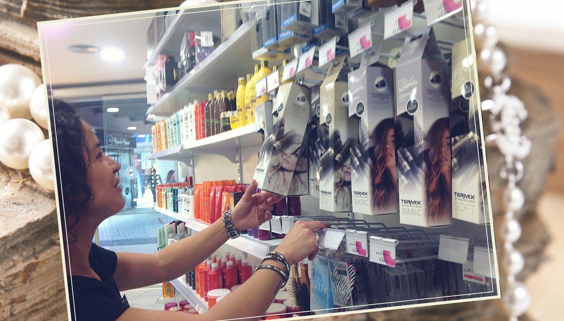
Keep it balanced and organized, even if you want to create a messy, though stylized sensation. And, most important: don’t overload it.
Hair salon tip: Using your shop window to promote an inside display will catch the eye, so that people passing by will know that you’re selling something unique inside, so that it doubles your outside visibility.
o.
Inside the shop
Before all, the inside of your shop must be accessible and easy to walk through, so that your customer experiments a real freedom of movement while unconsciously following a purchasing path you would actually have built for him.
Play with display / fixture
Here relies the key part of your decorating art: how to dispose the merchandise in your store?
Once again, it’s all about perception. And a shop has that in common with the wildest nature, that your attention is never drawn linearly… So, it has to be well organized so as to create a profusion sensation, without a messy effect. And for that, you have to know where to drag the eye to. You must create a visual path, knowing that the human being generally tends to look first on the right…
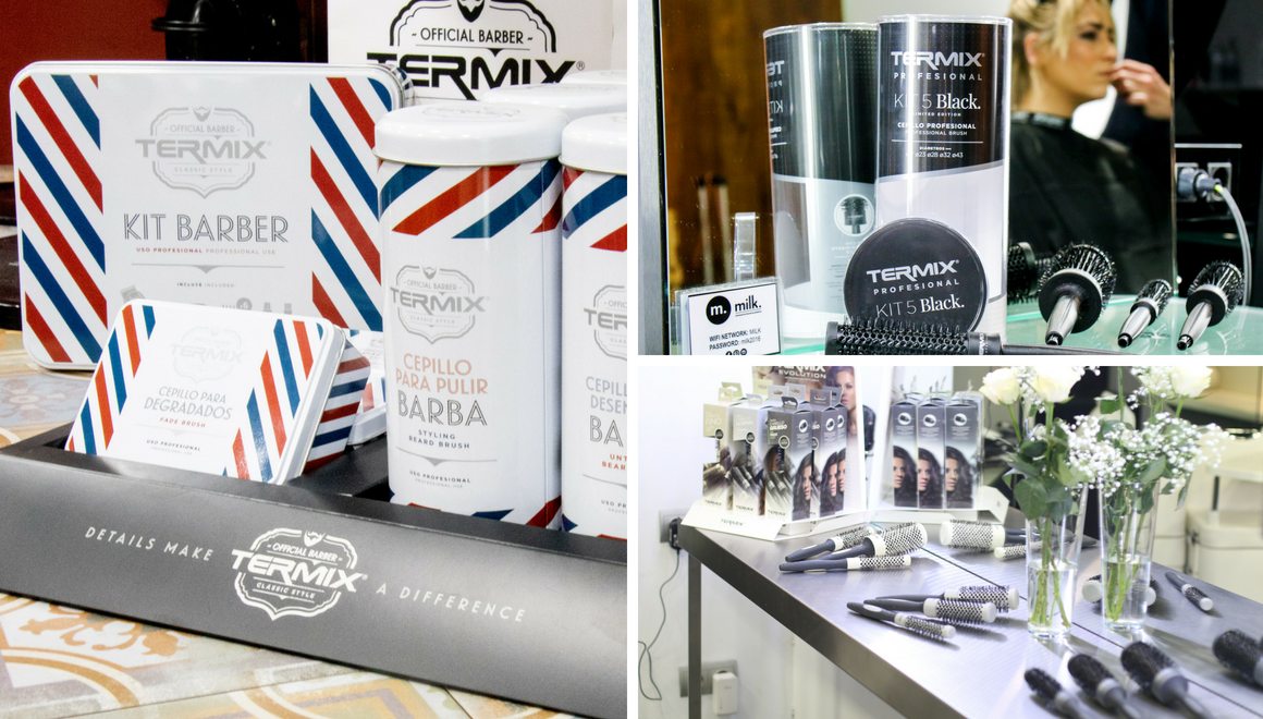
You can use fixture for a strong, stability sensation (generally the higher ones against the walls, and smaller, hand-height one at the center of the shop), and displays around the shop that you’ll frequently change to vary the purchasing path.
How to place your displays
- Identify your selling force zones: the window as a starter on the menu, with promotions to catch the eye. The entrance for special offers and then the best-sellers at the right level: it must meets the eye, by being just as high.
- Do not dispose the products too high, so that people can see them from everywhere.
- Make displays accessible to the hand, on a small table for instance.
Hair salon tip: use the workstation, in front of the customer when having a beard or haircut, so that it will incite him to touch and manipulate the product, and strongly identify. About 80% of the sales happen in the workstation!
- Play with the heights, so that there’s not only one and single line to follow, but varied possible eye-catchers.
- Group the products so that they tell a story together. The Barber desktop display units by Termix are of that kind, offering different types of natural brushes for beards, from untangling to styling, these same steps you’re going through with the customer.
- Your fixture should be in perfect harmony with your shop’s atmosphere, using the same colours or design a special disposal so that the products fully fit in the general setting. Your display, on the contrary, highlights a specific item or a product line, and it should thus by contrast catch the customer’s attention in one look.
The colour’s code
Your shop has to be unique and reflect your style. Using colours is a good way to brighten your shop, bring out emotions and influence the way your store and displays are seen.
Some colours are easily spotted and help identifying the place, products, quality and kind of service you provide.
As black gives a quality and professional tone, using different shades of black will identify you as a high-quality shop. If you need any proof, look at ancient European brands such as Chanel or Yves Saint-Laurent: black, white and simplicity, for a top-quality empire.
In hair sectors, some colours stand out, such as the combination on the barber’s pole, creating a universal item everybody can spot in a flash. This is why Termix used the same colour’s code on its Barber collection and this is how its display units are so easy to present and promote. Your customer will recognize the product line in a glimpse and the grouped disposal encourages cross selling.
By the way, did you know where these colours came from?

Enlighten your place and product
Last but not least: don’t neglect the effect of a good lighting. For the light is not only your assistant in your daily work (you need to see brightly to the thinnest little hair, in a hair salon), but also your best ally in creating the right atmosphere.
Depending on your customer base, you can play with brighter or smoother lights, as the first one mostly appeals the youngest and a soft light will entice adult and older customers.
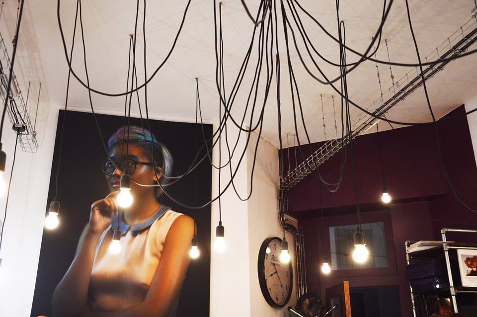
The one you need for work is your primary light. Your place needs to be correctly lit. Then, use accent lighting to spot some specifics, such as your displays. Using a bright light upon a display unit, you slightly speed the pace and entice into purchasing more impulsively.
And finally, the ambient lighting allows you to create a dramatic effect according to the setting and atmosphere you chose for your shop. Shadows, subdued light or coloured spotlights… Let your creativity guide you!

Leave A Comment